Showing posts with label Ancillary Task. Show all posts

Wednesday, 8 February 2012

Feedback!

In todays class, I set up a video, and then made my class mates watch my music video. I then prepared a list of questions to ask them in relation to my music video, and how the poster and digipak relate to the video.

From the response I got from them, it was apparent that although my music video is good, and that it works well under the genre conventions, there were a few mistakes which I was already aware of. Overall, the feedback was very positive.

Friday, 27 January 2012

All Three Final Products!

Music Video
Digipak

Poster/Magazine Advert
After looking at all three projects together, I believe that there is a clear marketing continuity pattern throughout which is very important through marketing for easy recognition. For example, If I had completely different styles and designs for each of the marketing pieces, as well as completely different style of music video, it becomes increasingly hard to market my song/Album.
Overall, I am thrilled with how they have turned out!

Thursday, 26 January 2012

Final Designs of Digipak

After much research, I have finally finished my Digipak! I believe that all aspects of the genre is featured in my digipak such as the typical logo, the genre conformation of using the brick wall and Alice looking very 'Street' much like the music video.
Front Cover
Back Cover
Left Inside cover
Right inside cover (Behind CD)


The inside of my digipak

For the inside of the album, At first, I was quite stuck with what I could use as the main images, as I had thoroughly experiemented with the Brick wall, and I wanted something different. Many of my classmates thought I should go with a more plain inside as the outside covers are quite graphic. initially tried just having a simple black background, however I felt this was too plain. I began experimenting with different layers and blending options by getting images off of google images such as starry skies and scratch textures and blending them into the background. I then found an image which I had taken of Alice for the first Outfit shoot which I had taken ages ago, and decided to play with that image to make it work well. I played with plenty of blending options till I found one which really does work, and blended it to the background. I then found an existing CD which I based my information on the back of my CD on.
Adding a Star sky layer and changing the blending modes.
Background ready to add Alice onto.
Adding Alice and erasing the background.
Changing blending modes to 'Pin Light'
Adding Text.
Final inside cover.
I also wanted to use the same image of the background which I had used for my inside cover so it will flow like a double page spread. Because this frame will be hidden behind the CD, there was little point decorating this frame more than some basic blending.
Behind the CD inside cover.

The CD Back cover

Because I had heavily featured the brick wall on the CD cover, I wanted to keep a running theme throughout the back of the CD as well. I also used the same font as the 'WARZONE' for the titles of the songs. I individually made each layer of each letter and placed them on each brick, which I tried to create the effect that the writing is written as grafitti on the wall. I also found the actual thinking of track titles hard, as I didn't really know what I could call them, however after reading through many different lyrics, it became increasingly easier. I then went to google to find a barcode for the corner of my CD back cover, and pasted it as a new layer and resized it. I then added my artists website along the top of the barcode which I actually thought looked very professional. I then seeked help from other existing CD's to get a feel for what is written on the back of a CD. After the text was written, the last finishing touch was the Recording company which I had chosen from previous research as 'Epic Records'.
Making the background B&W and adjusting size of cover.
Adding Letters and numbers.
Adding more track titles and numbers.
Adding a Barcode
Adding all small text, web address and Epic logo.
Final CD back cover!

The making of the front cover of the Digipak!

When I came to create my Digipak, the first thing I wanted to perfect was the CD cover. Because I already had my poster, I roughly knew how the CD cover should look, to keep it similar for easier recognition of the whole package of marketing, so I used the 'Brick Wall' photograph, and changed it to Black and White. I Then began to look through all of the photos of Alice I had to find the perfect image, and Copied her onto the image, and soon found that having Alice with only half a face was very effective. I also then added the same Logo and CD name. I also found that a lot of Rhianna digipaks came with a Parental advisory symbol, and I felt this would give the CD cover a more realistic view. I also edited Alice's face by airbrushing her face through photoshop, followed by the brightening of her blue eyes to make them stand out much more.

Sizing the image background
Changing the background to B&W.
Adding a new layer of Alice, Erasing existing background.
Brightening her eyes up using hue/Saturation
Finished Eye.
Positioning Alice on the CD cover.
Adding the Pre made Logo.
Adding CD Title
Final CD Cover.


Wednesday, 25 January 2012

The Poster/Magazine Advert!

After some more research into existing posters and magazine adverts, I found that almost all of the posters consisted of the same image, or images from the same photoshoot which are very similar to that of the CD cover, as well as a shot or two similar in one or more music videos. With all three being consistant, it makes it much easier for the audience to recognise what they are being sold.

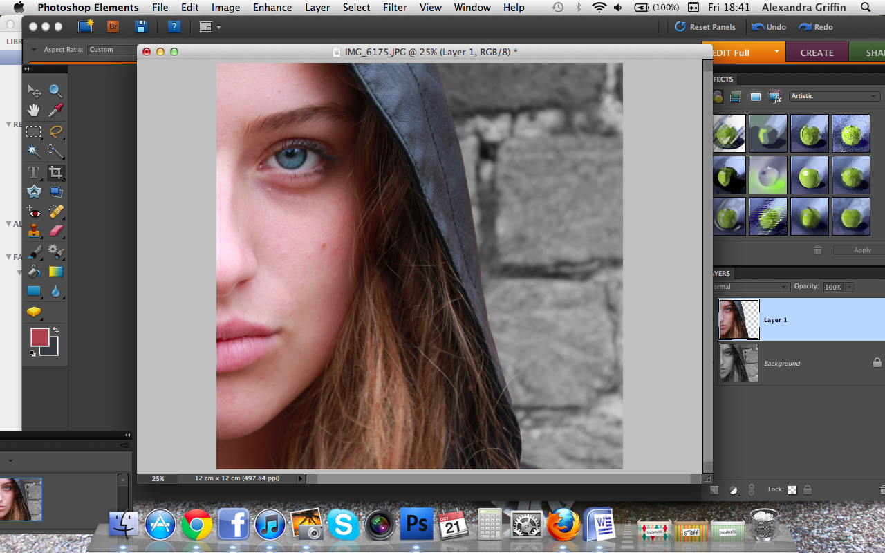
I Began with choosing the image that I felt works well for a Poster. I wanted to make the poster portrait, so I chose a clear Portrait image. I then highlighted Alice with the Magic Wand tool in Photoshop, and kept her colour, and made the background black and white by copying the layer of Alice. I then did come basic editing of the brick wall by using the Burn tool which makes some places darker than others which added more texture to the brick wall. I also then edited the reflection of her sunglasses where you could see me, and removed me so the glasses reflection was slightly more blurry, as well as airbrushing Alice's face. I then added the logo which I had previously edited before, and placed it above her head, and then made the decision that it looks better if Alice looks like she is standing in front of the name which then made the title look like grafitti.

After deciding upon the title of the album to be 'Warzone' based on the style of song and lyric from other songs within the RnB music industry, I placed the words in the same font as the title, as well as a made up web address.

A lot of posters heavily feature one song as their main selling point, and this song has usually been pre released, so therefor I wanted my song to be her main attraction song. I added the text under her arm.

After much other little tweeking, I had finished my final Music Poster!
I am so happy with how my poster has gone, and I believe that it conforms well to the typical RnB Music style, but adding her own style to it! I have asked for opinions along the way of creating the poster, and will post about all of the feedback in the next post.

Creating a Brand identity

The brand identity or logo for an artist is vital for simple recognition. After analysing previous CD covers before, I could refer back to see the style of logos being used currently.
From the research I had previously completed into the existing CD covers, it enabled me to thoroughly look through the styles of CD Titles and general logos. However, after much research, I found that there wasn;t a particular style which all RnB artists conform to, but they each have their very own style and it appears very up to them.

When thinking about my decided Artist name of 'Alyssa', I felt that the name was too short to abbriviate much like Jennifer Lopez as 'JLo', so I began playing around with different fonts from a variety of websites and slightly changing them through photoshop to create the perfect logo. Because a lot of my shots in the music video are quite 'Street RnB' with the brick wall and grafitti, I didn't want a 'Clean' looking logo such as Kelly Rowland's or the Sugababes, and I felt that a grafitti style logo would represent the style and look that I wanted Alyssa to have, similar to Alesha Dixon, and N-Dubz.

Whilst editing my final logo, i felt that the normal font was good, but  felt that like Nicole's logo with the different N, I wanted to change one of my letters to give it a personal touch, so I slightly bent the last A In Alyssa which I think works very well.
Overall, I am very pleased with my final Logo, and I feel that it will look very effective on my CD cover and Poster!

Wednesday, 18 January 2012

Poster and Magazine advert Research

When I came to research existing posters created for actual artists, I found that most of them stuck to the same image, or very similar to the CD cover for brand identity reasons. For example, Rhianna has used the exact same image for her poster as her CD cover, and used more information about the release dates of the album etc. After previous research of the CD covers which I had completed,(ALBUM COVERS RESEARCH POST) I began to work with ideas which I could use for my CD cover to work effectively, but also designs which I could encorporate a poster into the design for two effective pieces of work.
POSTER
CD COVER
I Also had to remind myself of previous research where I found a lot of artists use the same set for their CD cover photographs as in their actual music videos, meaning that I should keep a running theme of a shot in my music video, CD cover and poster all similar. I have decided that my 'Brick wall' feature in my music video is the most effective, and as well as my previous draft CD cover, I believe I can create an effective marketing scheme.

Friday, 23 December 2011

Artist Names

When deciding on an Artist name, I referred back to the other blogposts I had completed of research on other artists. I noticed that a lot of Artists used a simple name, almost like a statement, such as Rhianna, Beyonce, Alesha, Ciara, Shakira, Fergie and JoJo rather than using their first and last names much like an Indie artist may. This general trend within the R&B genre is very apparent, and therefore it was clear to me that I would like to conform to the trend.

I began playing with some ideas in my head, and came up with a few ideas such as:

  • Alice (The Actresses actual name)
  • Jayde
  • Kara (Too close to Ciara)
  • Sammy
  • Lia
  • Rosie
However a lot of the time, R&B artists names are usually quite original and quirky like Beyonce and Ciara. After reviewing my own ideas, I decided to quiz my peers within my Media class to see if they had any good ideas. A few suggestions were:
  • Alyssa (A play on 'Alice')
  • Jessii
  • Kelly
  • Grace
  • Kitti

To seek more ideas, I posted a question on Yahoo Answers. The question was the same as I asked my Peers.
On my question, not many responses came in, however I found a similar question which has already been asked which had a few good suggestions such as:

  • Malique
  • Willow
  • Etta
  • Angel
  • Breezy
  • Serenity
  • Celeste
After much considering of all my suggested names as well as my own ideas, I have decided to use the name 'Alyssa' as my artist name. I believe that it has the quirky edge to it much like 'Ciara' and 'Rhianna' and also fits the genre nicely.

Friday, 21 October 2011

First attempt of Editing a CD Cover

After my first photoshoot where I managed to take a series of photographs which I could use for my Digipak, I decided that I could attempt to edit my one of my photos to see how it could turn out.
This is the Photo I am experimenting with.
Firstly I zoomed into the eye to edit it closely.
Using the burn and dodge tool, I made the whites of Alice's
Eye much more white, as well as the 'Glisten' in the pupil.
I then highlighted the eye with the magic wand tool. I Then
wanted to make the blue in Alice's eye more vibrant.
Using Hue/Saturation, I Added saturation making the
blue stand out more.
The Eye finished!
I then highlighted around Alice using the Magic wand tool
again and copied and pasted her as a layer.
I could then make the background black and white, leaving
Alice in colour which looks very good in my opinion!
I Then closely cropped the image to leave half of her face.
I think this looks really effective as well!
As I haven't decided a name for my artist, Just to experiment
with typography, I used the phrase 'NAME'.  I also found a
pretty basic font.
I then Rotated the text to go down the side of the frame.
This is the result of my CD cover experiment!
Although this CD cover is very basic and not exactly how I want to do my real Digipak, I'm glad I experimented with RnB looks for my Digipak!

Friday, 14 October 2011

How music is distributed

The distribution of music is very different to ten years ago. The new ways of distributing music definitely makes accessing music much easier as the only way used to be to buy the CD from a shop, however now we can easily purchase a MP3 straight to our computers to place straight onto an MP3 Player/Ipod. To demonstrate the different ways a artist would distribute their music, I am going to focus on one artist in the same genre as my own song, Rihanna, and her album 'Rated R'.

The Website for Rihanna is very simple, and there is a clear section that says 'Shop' which leads you to a sub-website where they sell all of Rihanna's albums as well as merchandise such as mugs, signed posters and T-shirts. Although this form of purchasing an album is very costly, it is definitely official.

ITunes is the new hype which has revolutionised the way the public purchases CD's and MP3's. This new way of downloading MP3's is a great way to directly buy songs straight onto a Ipod which is also a major trend. This of course has limitations. Because of the huge amount of traffic for marketing which comes to iTunes, the cost per song does tend to be high. 

Amazon MP3 is also another way of purchasing MP3's directly. The pricing strategies of Amazon MP3 is aimed much lower than iTunes, although probably not as popular. The price for the album here is 3.99 compared to a staggering 6.99 on iTunes.

A very new form of buying music is also through retail brands which are now opening web downloading stores such as Tesco. Tesco also would sell the album in store for a competitive price for the physical album, however now they are competing with Amazon, iTunes and many more such as HMV and Zavvi.

After researching the different types of ways music similar to my own gets distributed, I feel that I now know more about the kind of industry and competitiveness in pricing there really is. It will help for when I come to create my magazine advert, I know who i'm pitching the advert to.