Thursday 29 March 2012

The Final Products.

Music Video
Digipak

Poster/Magazine Advert

4. How did you use media technologies in the construction and research, planning and evaluation stages?


3. What have you learned from your audience feedback?


After asking my classmates what their first impressions are after watching the music video, I was quite happy with the response because they were all positive. One of them said that they think I successfully conveyed the genre of the music video, another said that the fast edits made it look very RnB and one also commented on the direction that Alice had been given, especially with the RnB feisty attitude. From these responses, it taught me that I have done a good job on creating a music video, which is typically RnB, as well as directed Alice in a way to allow her to be good at the RnB attitude, which many existing videos contain.

The next question I asked my classmates was the bits they liked the most which was again surprising answers they came back with. One person referred to the part where I cut one continuous shot of Alice up on the beat, and then zoomed in on a few of the short shots which made it look like lots of small shots which kept the pace of the music video. One other of my classmates also agreed that it worked well to cut the music video to the beat of the music. Another person suggested that they liked the colouring of black and white which also changed to the beat of the song because they liked that it kept the video interesting. Another shot which was particularly popular with all class mates was the CCTV style shot where there was a shot of a camera, then a black and white graded shot of Alice looking up at the camera, almost a shot reverse shot clip which they all agreed worked really well. From this question, I was able to understand smaller details which worked well, and bits which were particularly effective and therefore were a successful hit from the customer or target markets point of view.

I also asked the question of what the group actually thought the music video was about, or what was being represented. This question was aimed to find out exactly what they understood about the music video alongside the audio. One person suggested that the song was about a guy which the singer thought was particularly attractive and that the music video could have been improved with a male actor in the video. This is something that I had originally planned to include, however after reviewing the footage and editing the male lead into the video, it began to be confusing with narrative as well as performance. Another person suggested that it could work well if I had used two dancers either side of Alice in a few wider shots which was something that I hadn’t actually considered, however this could have worked well.

My next question was asking them how successfully I had managed to make the music video look conventionally RnB. The whole group agreed that I had made my music video look conventional in the RnB sense, and one person said that I had gone into a lot of detail with mise en scene with the attention to detail in Alice’s costume, and locations for Alice to act in. One other classmate suggested that the colouring I had used was good, however suggested that some more darker and grungy colours could have worked better with the genre and typical RnB music video. Another person suggested a few more locations could have been used, however I do think that the settings I had used were sufficient for the music video.

My penultimate question was any other improvements which I could have done to make the music video better, and to this I received some good advice. One of my classmates suggested some more full body shots rather than close ups a lot of the time, which I agree would have made the success of my music video better. One also reiterated the point of backing dancers would have worked well, and that the extreme close ups worked well but there needed to be more of them. Overall, I was in agreement with these minor improvements. There were a few slight glitches with some editing such as a shot where a studio light could have been seen in the corner of a shot, as well as the issue which I was aware of that my reflection could occasionally be seen in Alice’s sunglasses. These are all issues which I would have resolved had I not lost the footage when my hard drive broke, and had to use my first draft as my final video, however these issues are only minor, and did not matter too much.

My final question was some final thoughts of the video overall which were again all very positive which I was happy about. Words were used such as Very good and successful which all helped me to understand that the music video worked well overall from an audience point of view. One of the classmates said how it was clear that different styles of RnB were conveyed well and that it was clear that a lot of research had gone into the final music video. One person also mentioned that it was clear that I also do photography because the level of success with the shot framing and photography for the ancillary texts were well shot.

Overall, I have learnt from my audience feedback that there are minor details which I needed to have tightened and there were some suggestions which could of helped improve my music video such as including some dancers and a male actor, however overall, the music video was a good success and that it also fits with the RnB genre very well.

2. How effective is the combination of your main product and ancillary texts?

1. In what ways does your media product use, develop or challenge forms and conventions of real media products?

Wednesday 8 February 2012

Connotations for my music video

A Connotation is a translated message which the producer would like the audience to read through different signs and signifiers. For example, If there was a girl dressed in black (Denotation), the connotation of this could be symbolising death, bad or evil, however we read this as the denotation with the connotation in mind.
Within my music video, I believe that I have used this media term quite a lot in translating the message to the audience. For example, the typical use of my brick wall in a lot of my shots connotes the whole RnB theme of the 'streets' where it may not be very wealthy, however Alice looks wealthy, hence the contrast.

 Another connotation which is apparent is the beauty of Alice constantly, which emplies that although she is singing about a boy which is extra good looking but not right for her, that she is quite used to turning men away, which actually gives a different attitude to the performer, and also an attitude for young aspiring girls to have.

I have also chosen to connote a different type of outfit style with Alice wearing not the total revealing clothing like many RnB, but to use more covered up clothing, in the hope to appeal to more of a younger audience without it being to close to the line.

Feedback!

In todays class, I set up a video, and then made my class mates watch my music video. I then prepared a list of questions to ask them in relation to my music video, and how the poster and digipak relate to the video.

From the response I got from them, it was apparent that although my music video is good, and that it works well under the genre conventions, there were a few mistakes which I was already aware of. Overall, the feedback was very positive.

Wednesday 1 February 2012

Applying Andrew Goodwin's theory to my music video

'Music Videos demonstrate certain genre characteristics'As part of my research before starting my music video, I came up with a list of Genre characteristics of RnB (Previous Blog Post). From this list, I believe that I have included many of these characteristics in a variety of ways.

  • A Running Narrative of a love/heartbreak story
    Although my music video doesn't actually have a narrative due to my decision to take out the 'Boy' shots, I still believe that during the song, she is telling the story of the love/heartbreak which she is feeling towards this boy.


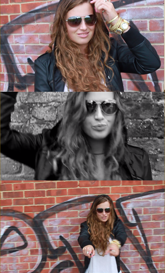
  • Close-ups of Females- A lot of Objectification
    This characteristic which I had established right at the beginning of research is one that I have heavily conformed to. I have used a variety of shots, ranging from close ups of her hands, legs, and predominantly her face.


  • Extreme Close-ups in general

  • Again, this point has been addressed within the extreme close ups objectifying Alice which I have included, especially the montage of shots for the 20 second opening.


  • Women Dressed revealingly
    Although I haven't chosen overly revealing clothing for Alice, I have chosen outfits which look 'Sexy' Such as the skinny jeans and the white strap top which Alice could still feel comfortable in wearing, but will also conform to the sexy look.

  • Some form of Performance/Miming
    The majority of my music video is Miming and performance which directly completes this general RnB music video convention.


  • A Male actor in female artist videos

  • Although my music video was initially going to contain a male actor in my music video, I didn't feel it was right after much reviewing of the footage I had captured along side the footage of Alice.

  • Expression of Rich and Poor- Usually jewelry/money

  • I bought Alice some chunky gold jewelery to wear during the music video from Primark, and although it was only cheap jewelery, the actual jewelery that would be used in this style of music video by professionals with a much bigger budget would be much more appropriately expensive.

  • Hand held camerawork
    The majority of the camera work I filmed was hand held for that extra movement to keep the music video fast pased much like the pace of the actual song.

  • Slow Motion scenes- (Emphasis on artist usually)

  • I didn't actually slow any of the frames when editing, however I did use a lot of close ups which had a longer cut than the majority of other shots, such as the shot of Alice running her hand down her leg.

  • Glamourous costumes

  • I think that after reviewing the costume designs which I purchased for the music video, I believe that the costumes fitted well with the RnB genre, especially the leather jacket costume and the plain white top with jewelery, as they each look glamourous and 'Street' enough to tie in with my music video conventions.

  • Lots of Pans over the artist/Narrative

  • A lot of my shots were slight pans over Alice for the movement aspect of the music video, which again is a typical convention of RnB. The close ups of Alice were especially the pans which worked out well.

  • A Solid dance routine throughout/featured in the video

  • This is one aspect of RnB which I did not use thoroughly as the drama studio footage did not work well enough for it to work within my music video, and after reviewing my other footage, it wasn't necessary to include dance footage.

  • Contrasting lighting tones- either warm colours signifying love, or cold colours.

  • Although this convention is not apparent in all music videos under the RnB genre, it does appear in some. I  didn't actually contrast the lighting tones to warm and cold, however i used Black and white and colour, as well as some harsh colour grading on the 'Purple' shots where I have coloured the clips.

  • 'Backstreet' Scenes especially in Hip-hop style R&B

  • The majority of my music video is based around Alice singing with the brick wall and graffiti behind her. This is a very typical 'Street' shot because a typical shot would include some brick walls.

  • An expression of Race- usually involving black/half cast actors

  • This is another convention which I did consider, however decided against it due to the lack of actors which I could use.

    'There is a link between the lyrics and the visuals'
    Although there is no clear link between an object or thing in shot and the lyrics perfectly describe the object, there is subtle lyric and visual links. For example, on some lines where Alice is singing lyrics where she is more expressive with how she says the lines, she shows more aggression where the music emplies this.
    'There is a link between the music and the visuals'
    In my music video, I wanted the visuals to have the same pace as the music. The way I achieved this is cutting the music video clips together in time with the beats of the music. This worked out well as it meant that the music video is perfectly in time with the visuals which has worked well.

    'The Demands of the record label will include the need for lots of closeups on the artist'
    I have used endless closeups of the artist during my music video of a variety of different parts of Alice such as her hand, her leg, and many close ups of her face and mouth. This is not only a Goodwin criteria, but also a typical convention of the RnB genre, so this was definitely going to have to be a heavily featured shot.

    'The Artist may develop iconography that recurs across their work'
    Although this is a feature which I cannot control, but if I made another music video with Alyssa, I would use the same or very similar ending shot which fades away as she walks away after a final glance at the camera.

    'There is frequent refrence to the notion of looking'
    The majority of my music vidoe features Alice singing directly at the camera which shows her direct approach to the audience of the music video. There are other looking moments where she looks around, however, I needed the majority to be very direct to the audience.

    'There are often intertextual references- mostly to film, other music artists, television and popular culture'
    Although this is not completely apparent, there is traces of Rhianna, Beyonce and Jojo throughout my music video through attitude, and choreographed moves such as the arm movements which inspired me hence the use of this throughout my music video.

    Friday 27 January 2012

    All Three Final Products!

    Music Video
    Digipak

    Poster/Magazine Advert
    After looking at all three projects together, I believe that there is a clear marketing continuity pattern throughout which is very important through marketing for easy recognition. For example, If I had completely different styles and designs for each of the marketing pieces, as well as completely different style of music video, it becomes increasingly hard to market my song/Album.
    Overall, I am thrilled with how they have turned out!

    The final music video!

    Because of the external harddrive issues, This is now my final music video! I am very happy with the way it has turned out, and I believe that it is a great final video after the journey of research and planning have taken out.

    Massive Set back!

    Today I have had a massive problem as my external harddrive which contained my music video premiere project files and all my footage decided to wipe itself. This was initially very worrying. I took the external device to the tech guys at school, and they were unable to retrieve any files off of it. This contained all of my footage, as well as many other projects for my other A level subjects. After reviewing what could be done, I still did have my music video saved on youtube which was going to be my final draft, however there were not many improvements that needed to be done, only some minor cropping issues in some shots like this.
    As you can see, you can see a light on the right side.
    Although this was initially a pain, I have been lucky that I still have my draft! I don't think this is too much of a problem, as it was only a few shots which needed to be improved after reviewing the video.

    Thursday 26 January 2012

    Final Designs of Digipak

    After much research, I have finally finished my Digipak! I believe that all aspects of the genre is featured in my digipak such as the typical logo, the genre conformation of using the brick wall and Alice looking very 'Street' much like the music video.
    Front Cover
    Back Cover
    Left Inside cover
    Right inside cover (Behind CD)


    The inside of my digipak

    For the inside of the album, At first, I was quite stuck with what I could use as the main images, as I had thoroughly experiemented with the Brick wall, and I wanted something different. Many of my classmates thought I should go with a more plain inside as the outside covers are quite graphic. initially tried just having a simple black background, however I felt this was too plain. I began experimenting with different layers and blending options by getting images off of google images such as starry skies and scratch textures and blending them into the background. I then found an image which I had taken of Alice for the first Outfit shoot which I had taken ages ago, and decided to play with that image to make it work well. I played with plenty of blending options till I found one which really does work, and blended it to the background. I then found an existing CD which I based my information on the back of my CD on.
    Adding a Star sky layer and changing the blending modes.
    Background ready to add Alice onto.
    Adding Alice and erasing the background.
    Changing blending modes to 'Pin Light'
    Adding Text.
    Final inside cover.
    I also wanted to use the same image of the background which I had used for my inside cover so it will flow like a double page spread. Because this frame will be hidden behind the CD, there was little point decorating this frame more than some basic blending.
    Behind the CD inside cover.

    The CD Back cover

    Because I had heavily featured the brick wall on the CD cover, I wanted to keep a running theme throughout the back of the CD as well. I also used the same font as the 'WARZONE' for the titles of the songs. I individually made each layer of each letter and placed them on each brick, which I tried to create the effect that the writing is written as grafitti on the wall. I also found the actual thinking of track titles hard, as I didn't really know what I could call them, however after reading through many different lyrics, it became increasingly easier. I then went to google to find a barcode for the corner of my CD back cover, and pasted it as a new layer and resized it. I then added my artists website along the top of the barcode which I actually thought looked very professional. I then seeked help from other existing CD's to get a feel for what is written on the back of a CD. After the text was written, the last finishing touch was the Recording company which I had chosen from previous research as 'Epic Records'.
    Making the background B&W and adjusting size of cover.
    Adding Letters and numbers.
    Adding more track titles and numbers.
    Adding a Barcode
    Adding all small text, web address and Epic logo.
    Final CD back cover!

    The making of the front cover of the Digipak!

    When I came to create my Digipak, the first thing I wanted to perfect was the CD cover. Because I already had my poster, I roughly knew how the CD cover should look, to keep it similar for easier recognition of the whole package of marketing, so I used the 'Brick Wall' photograph, and changed it to Black and White. I Then began to look through all of the photos of Alice I had to find the perfect image, and Copied her onto the image, and soon found that having Alice with only half a face was very effective. I also then added the same Logo and CD name. I also found that a lot of Rhianna digipaks came with a Parental advisory symbol, and I felt this would give the CD cover a more realistic view. I also edited Alice's face by airbrushing her face through photoshop, followed by the brightening of her blue eyes to make them stand out much more.

    Sizing the image background
    Changing the background to B&W.
    Adding a new layer of Alice, Erasing existing background.
    Brightening her eyes up using hue/Saturation
    Finished Eye.
    Positioning Alice on the CD cover.
    Adding the Pre made Logo.
    Adding CD Title
    Final CD Cover.


    Wednesday 25 January 2012

    The Poster/Magazine Advert!

    After some more research into existing posters and magazine adverts, I found that almost all of the posters consisted of the same image, or images from the same photoshoot which are very similar to that of the CD cover, as well as a shot or two similar in one or more music videos. With all three being consistant, it makes it much easier for the audience to recognise what they are being sold.

    I Began with choosing the image that I felt works well for a Poster. I wanted to make the poster portrait, so I chose a clear Portrait image. I then highlighted Alice with the Magic Wand tool in Photoshop, and kept her colour, and made the background black and white by copying the layer of Alice. I then did come basic editing of the brick wall by using the Burn tool which makes some places darker than others which added more texture to the brick wall. I also then edited the reflection of her sunglasses where you could see me, and removed me so the glasses reflection was slightly more blurry, as well as airbrushing Alice's face. I then added the logo which I had previously edited before, and placed it above her head, and then made the decision that it looks better if Alice looks like she is standing in front of the name which then made the title look like grafitti.

    After deciding upon the title of the album to be 'Warzone' based on the style of song and lyric from other songs within the RnB music industry, I placed the words in the same font as the title, as well as a made up web address.

    A lot of posters heavily feature one song as their main selling point, and this song has usually been pre released, so therefor I wanted my song to be her main attraction song. I added the text under her arm.

    After much other little tweeking, I had finished my final Music Poster!
    I am so happy with how my poster has gone, and I believe that it conforms well to the typical RnB Music style, but adding her own style to it! I have asked for opinions along the way of creating the poster, and will post about all of the feedback in the next post.

    Creating a Brand identity

    The brand identity or logo for an artist is vital for simple recognition. After analysing previous CD covers before, I could refer back to see the style of logos being used currently.
    From the research I had previously completed into the existing CD covers, it enabled me to thoroughly look through the styles of CD Titles and general logos. However, after much research, I found that there wasn;t a particular style which all RnB artists conform to, but they each have their very own style and it appears very up to them.

    When thinking about my decided Artist name of 'Alyssa', I felt that the name was too short to abbriviate much like Jennifer Lopez as 'JLo', so I began playing around with different fonts from a variety of websites and slightly changing them through photoshop to create the perfect logo. Because a lot of my shots in the music video are quite 'Street RnB' with the brick wall and grafitti, I didn't want a 'Clean' looking logo such as Kelly Rowland's or the Sugababes, and I felt that a grafitti style logo would represent the style and look that I wanted Alyssa to have, similar to Alesha Dixon, and N-Dubz.

    Whilst editing my final logo, i felt that the normal font was good, but  felt that like Nicole's logo with the different N, I wanted to change one of my letters to give it a personal touch, so I slightly bent the last A In Alyssa which I think works very well.
    Overall, I am very pleased with my final Logo, and I feel that it will look very effective on my CD cover and Poster!

    Wednesday 18 January 2012

    Poster and Magazine advert Research

    When I came to research existing posters created for actual artists, I found that most of them stuck to the same image, or very similar to the CD cover for brand identity reasons. For example, Rhianna has used the exact same image for her poster as her CD cover, and used more information about the release dates of the album etc. After previous research of the CD covers which I had completed,(ALBUM COVERS RESEARCH POST) I began to work with ideas which I could use for my CD cover to work effectively, but also designs which I could encorporate a poster into the design for two effective pieces of work.
    POSTER
    CD COVER
    I Also had to remind myself of previous research where I found a lot of artists use the same set for their CD cover photographs as in their actual music videos, meaning that I should keep a running theme of a shot in my music video, CD cover and poster all similar. I have decided that my 'Brick wall' feature in my music video is the most effective, and as well as my previous draft CD cover, I believe I can create an effective marketing scheme.

    The First Draft!


    I have finally edited the whole of my music video. There are a few changes which I still need to make such as a few of my shots have the lighting in the corner of the shot, However I have exported the music video for audience feedback. I'm thrilled with the progress i've made so far!

    Editing- The Closing shot

    For my final shot to end the music video, I wanted a sequence which will really capture the 'Attitude' which Alice has throughout the video. She glances at the camera, with a confident smile and walks away. As she walks away, it slowly goes out of focus and fades to black. I am thrilled with my music video so far, especially the ending sequence.

    Editing- The 'Brick Wall'

    My brick wall footage has worked very well. I have again used some edits which are in black and white, as well as some purple coloured ones for some change.

    I have also used the conventional close up very much in my music video which conforms to the obvious RnB close ups which clearly objectify the artist.

    This is my Purple edited shot which gives the video some more variety.

    Changing The narrative (George Footage)

    Although I didn't ever intend for my music video to have a running narrative throughout the video, I did want to have the 'Boy' scenes for some kind of recognition of who she was singing about. However, after reviewing my footage (Which I did particularly like the framing and lighting!), and editing it together alongside all of the Alice Miming clips to give it a meaning, I simply didn't feel it worked well, and the 'Boy scenes' simply looked added in. However I did not make the decision on my own, I referred to my Peers who all agreed with me that the scene with George looked too randomly placed within my music video which heavily consisted of continuous shots of Alice.
    Although it now means that my Music video is totally performance based, I do feel like it gives more of a direction for the audience to view the video.

    Editing- First problem!

    Today, I have been continuing to edit when I came across my first big issue. When playing back the footage, I noticed that in the reflection in Alice's sunglasses, you can clearly see me filming her! This is very irritating as the shots are brilliant and really work, but that slight problem is proving to be a big problem. However, once i've been playing around with quicker edits, I began to notice it less and less as the clips were each very quick. I have decided not to refilm as I think that as long as the clips are short, they shouldn't be too noticeable.

    More Editing Progress (Photography Studio)

    The photography studio shoot has proved to be very good footage within my music video. Originally the colours were slightly too dull, however after brightening the contrast on the clips, it gave a very white background which works well. I have also used some Black and white effects within the edits to give some variation which works well. I have also now pieced together the first 30 seconds of the music video which is real progress.

    Editing! (CCTV Shot)

    The past couple of weeks,I have been continuing with editing my music video. In my initial plans, I had visions of creating a really creepy CCTV style shot sequence much like In Nicole Shertzinger's Music video to her single 'Wet'. After much playing around with the sequence which I shot of Alice, I began to style it much like a CCTV image would look. Although in Nicole's video she uses a green colour over the footage, I found after much research that most CCTV images are filmed in black and white hence the decision of colour grading my own sequence. I also noticed the heavy useage of Timescales and different timecodes running in the corners of most CCTV shots. Although this was proving very dificault in my own video, I managed to add a Timecode to represent this. Another key feature of the CCTV style shot is the use of high angles looking down on the characters, which I have also used.
    Nicole's CCTV Shot
    My own CCTV styled shot
    I have also kept on top of other editing such as piecing together the lip syncing which especially takes a lot of time. I also have began to change the contrast and saturation as well as cropping many of the clips to make them stand out more.

    Editing update (Drama Studio)

    For the last week, I have been editing my music video. I have made some real progress! I have now edited the introduction of the music video, Approximately 20 seconds, as well as the first 10 seconds of miming. However, after reviewing my footage and attempting to piece it together into the video, I found that the Drama studio footage particularly didn't work. I believe that it does not have the same effect which I imagined much like the Ciara Music video which although was a bit of a pain, I still think that it was the right decision to edit these shots out of the music video.